How to Evaluate Visualizations
Questions we can ask to start critically evaluating data visualizations
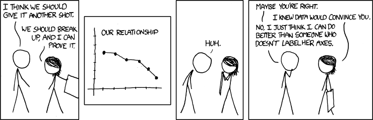
Is source data cited?
Read over the full visualization and accompanying text. Unlabelled elements, lack of citation to data sources, and lack of authorship information should raise immediate red flags.
Try to find out more about the data source: Is it authoritative and up to date? What is the quality? Are they clear about uncertainty? Is this data correct for the question? What information is missing?
Try to think about biases: What biases are in the data? What biases did the visualization creator introduce and what are your own that impact interpretation? Are text descriptions biasing your impression of the data?
Is the visualization well designed?
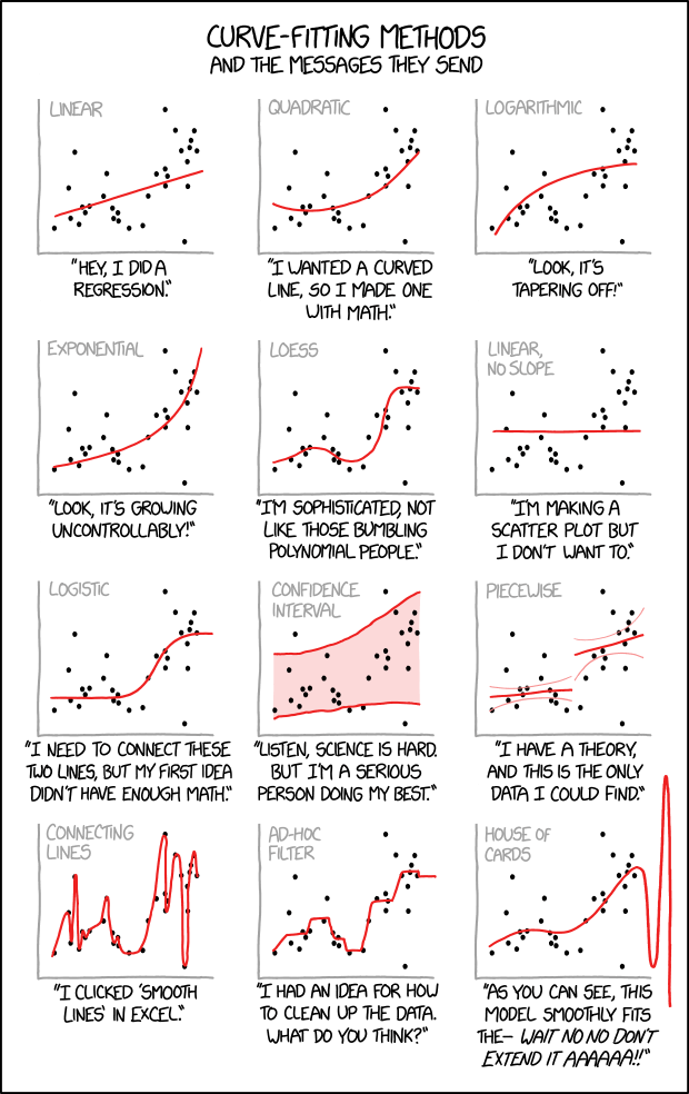
Choosing the wrong type of chart for the specific data and question can make a visualization misleading or confusing. Each chart type can help reveal specific relationships and patterns in the data, and also may create specific limitations on our ability to compare elements.
Does the chart type support the visual argument or comparison (e.g. Data to Viz Caveats)?
Do design elements, such as unnecessary embellishment or bad color choices, make it confusing to read?
Does the chart follow conventions and expectations (e.g. natural color progression of values, numbers rise as they go up the axis)?
Is there too many variables or data points (e.g. “spaghetti charts”)?
Are statical elements used correctly (e.g. trend lines tweaked to change your perception of the data)?
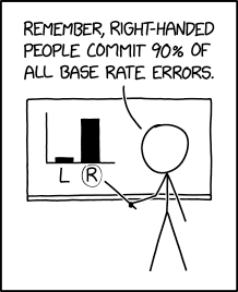
Is the scale correct?
One extremely common misleading feature is misusing scale in charts–such as omitting the baseline, truncating an axis, or using different axis. This is often done to exaggerate or diminish the appearance of change, e.g. stretch the x-axis to make line chart appear steeper or flatter.
Is the data appropriate?
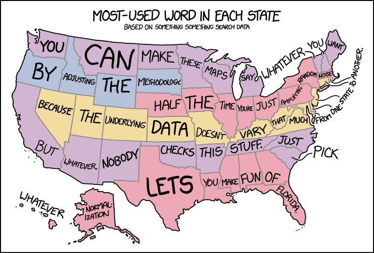
Visualizations are summarizing and abstracting data so that we can understand complex patterns and huge volumes of information in a concise representation. However, this process can incorrectly omit or cherry-pick (such as removing data to smooth trends, limit scope, binning) to present only the most convincing slice of the data. This is often confounded statistical bias and our own confirmation bias.
Are the patterns misleading?
Are the trends or variables depicted in the visualization actually related?
Charts make it easy to correlate causation between totally unrelated or random things, see Spurious Correlations. In fact, random processes rarely appear random–we want to make data into a story and naturally seek patterns in it!
Other common issues are incorrectly using absolute vs relative values, e.g. distributions on a map that simply match population density, dollar amounts compared without inflation, or failing to use per population.